I have been doing quite a number of facebook covers for my friends and myself. It's quite fun, but also challenging, as to what words to put in, what topic to present, what kind of feelings you wish to bring across.
When designing Facebook covers, I will always make sure that my design fits in both pc browser and mobile app/browser. Elements placed outside the mobile app/browser width will be cut off. So always remember to position the key element in the middle.
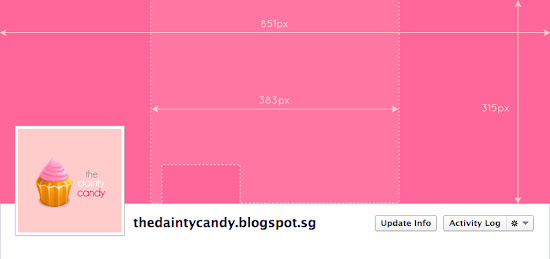
Here's a diagram showing the dimensions and positioning. The area in the center that is outlined by dotted lines, is the area to put your key elements in the cover photo. Do take note of the hole at the left side, as that is the location of the display picture in mobile app/browser.
The positioning seems straightforward? Try it yourself. Here the dimension to save your final file.
- 851px x 315px
Here are a few Facebook covers that I did.
Notion Age Chinese New Year theme
Adaption of the Chinese New Year Card that I've designed for my employer's company.
Valentines Day
Did this for myself. Sweet salmon pink as the main colour. Messenger love bird delivering a love letter, with the message "Love you..."
Valentines Day
Misslittlepatches asked for a Valentines Day cover. Did a sweet pink penguin version for her.
Valentines Day
My girlfriend TS asked for a Valentines Day cover aftering seeing mine. Adapted from my version and came up with a lovebirds version.
Me.Penguin
Misslittlepatches shared a penguin image with me. I had adapted from it and transformed it into a sweet pink Misslittlepatches version.
Subscribe to:
Post Comments (Atom)


Where is mine? :X
ReplyDeleteHaha.. I did duplicate the Lovebirds version in pink color for u too. But I worry I will abit extra, so didn't dare send =P Haha..
ReplyDelete